Clinical Courier — Kerecis Newsletter Concept
A speculative internal newsletter built while interviewing for Kerecis's MSKA Operations Intern role, after the job description listed 'newsletters, infographics, and communications using PowerPoint and Canva' as a core deliverable. Nobody asked for a sample. I made one anyway.
The prompt nobody gave me
Partway through interviewing for Kerecis’s MSKA (Medical Strategy and Knowledge Advancement) Operations Intern role, I read the job description closely enough to land on one specific line: “Create professional presentations, templates, newsletters, infographics, and communications using PowerPoint and Canva.” It wasn’t a take-home assignment. Nobody asked to see a sample. But a rendered mockup makes a far stronger case for that line than a bullet point on a resume, so I built one anyway, an issue of an internal newsletter I called the Clinical Courier.
Note 1This is speculative, unpaid, unsolicited work made on my own initiative to show a skill rather than describe it. I want that stated plainly, not discovered later.What the format actually has to do
A field newsletter for a med-device sales org lives under a strange constraint: it has to be scannable in under a minute by someone between meetings, and it has to hold up under pressure from a skeptical clinician five minutes later. Reps aren’t reading this newsletter for pleasure, they’re reading it to borrow its confidence in a room where someone else is asking hard questions.
The structure I designed
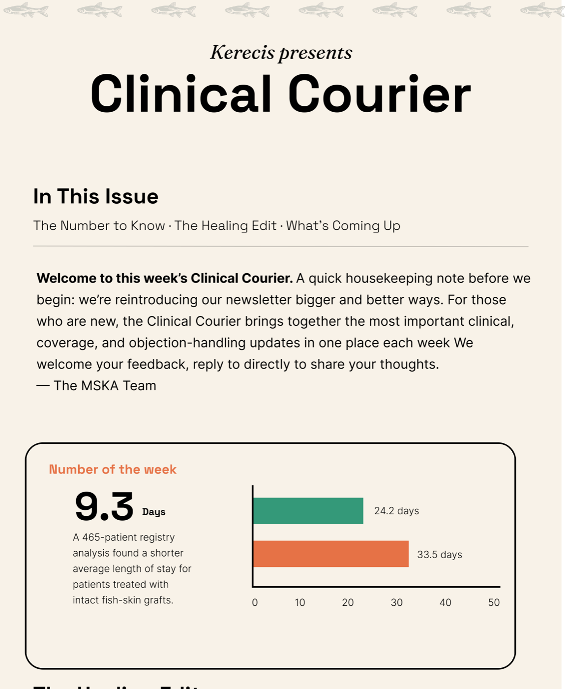
- Masthead and “In This Issue.” A three-second orientation: what’s in here, who it’s from, why you should keep reading this week instead of archiving it.
- Number of the Week. One stat, one comparison chart. This is the piece I spent the most time on: it compresses a paragraph of registry data into a single number a rep can recite unprompted, with the supporting bars right there if someone pushes back.
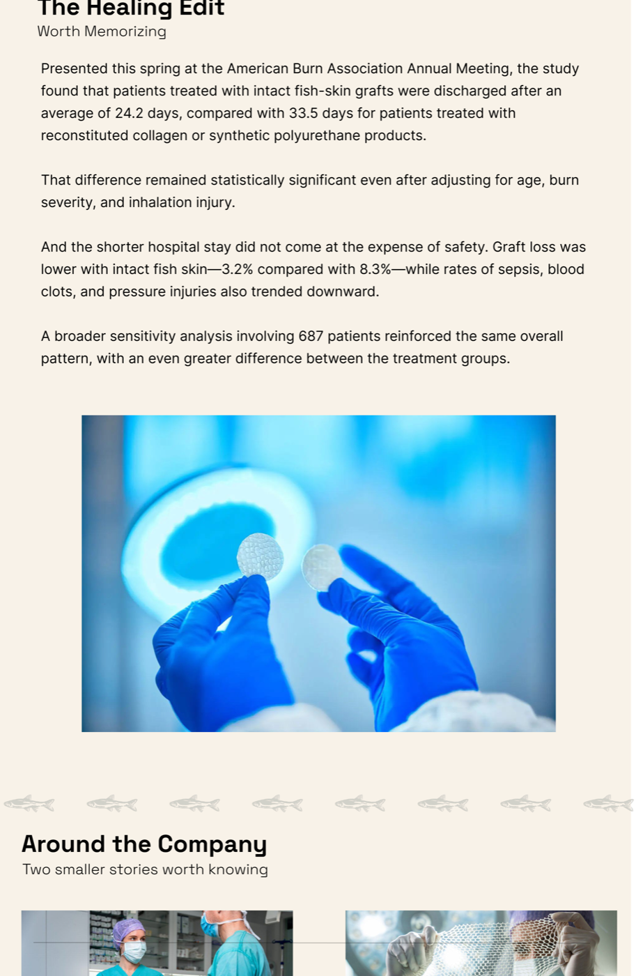
- The Healing Edit. The evidence underneath the headline number, ordered the way a skeptical clinician would actually interrogate it, discharge numbers first, then the adjustment for confounders, then safety data, then the larger sensitivity analysis. Front-loading the caveat instead of burying it was the deliberate choice.
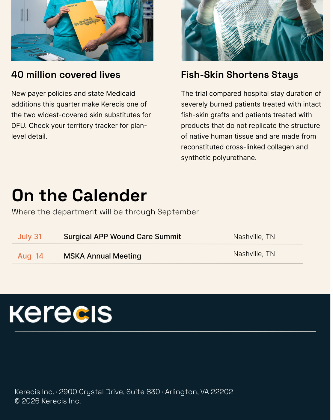
- Around the Company. A lower-stakes, two-column digest for the stories that matter but don’t need a whole section, coverage news, trial recaps.
- On the Calendar. A plain, scannable table. The one accent color from the stat card reappears here on purpose, so the whole issue reads as one system instead of five unrelated blocks stapled together.
The screens
What I’d actually want to test
Because this was never commissioned, there’s no real reader feedback to report, and I’m not going to invent any. The honest next step, if Kerecis ever wanted this template for real, is a much smaller test than “do people like it”: can their actual sales and clinical-affairs team produce next week’s issue from this template in under an hour, without me in the room. That’s the constraint I’d design toward next, not polish.